
Starting a business is an exciting endeavor! You’ve taken a significant step on your entrepreneurial or freelancing journey. Congratulations on your decision, and I hope this extensive guide will help you, especially when you’re on a budget.
- What is a Brand?
- Why is Branding Important?
- How to Create Your Company’s Brand from Scratch
- Branding is the Foundation of a Strong Company
Sometimes, people start a business concept with just the products or services and take little time and effort to decide on branding because they view branding as a luxury rather than a necessity. The good news is that you can develop a brand from scratch without spending.

You may already have figured out the products, services, and pricing when you contemplated your business idea. The crucial next step is determining what brand you want to create. You should also allocate a budget for branding and marketing to ensure your business’s long-term success and sustainability.
What is a brand? Why is it important? How can you create a brand from just an idea?
This comprehensive guide discusses the intricacies of branding and the process of designing and developing a brand. This is how my company conducts branding for clients.
What is a Brand?

You likely associate brands directly with specific products and services. For example, if you look at your phone, you’ll see a logo that indicates the company responsible for manufacturing and developing your device. Brands like Apple or Samsung offer a series of devices known for their consistent quality, so you already know what to expect when you see their logo.
Definition
A brand is a distinct identity that defines a company and establishes a connection with its products and services. A brand is fundamental to a successful company, playing a crucial role in shaping consumer perceptions and influencing purchasing choices, often without us even realizing it.

History
The concept of branding has a long history, dating back over 7,000 years to symbols and engravings used by artisans in ancient civilizations. It evolved through watermarks, personal, and mass branding during the Industrial Revolution. The Trade Marks Registration Act of 1875 marked branding as a legal ownership. James Walter Thompson pioneered trademark advertising in 1901, leading to slogans, mascots, and radio jingles.

Branding constantly evolves with the availability of new technology, techniques, and communication strategies. TV commercials in 1941 and brand management by companies like Procter & Gamble in the mid-20th century further shaped branding. Apple’s 1984 Super Bowl commercial changed branding by emphasizing emotions over product features.
Why is Branding Important?
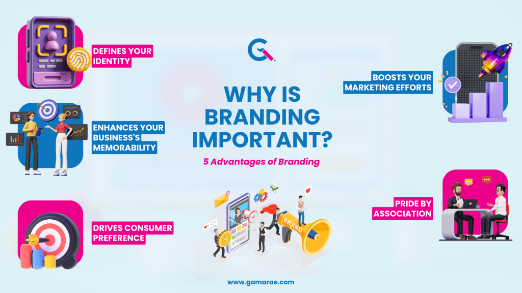
Your brand is a cornerstone of your organization’s success, particularly during the early stages of a new business. A brand’s value is similar to a person’s name and ancestral history. Just as a name carries a legacy and reputation, a brand embodies the essence of a business, reflecting its mission, vision, values, heritage, and reputation.
A brand gives the following advantages:
- Defines your identity – allowing you to establish a clear and recognizable presence in the market.
- Enhances your business’s memorability – making it easier for consumers to remember and recognize your brand over competitors.
- Drives consumer preference – creating a positive perception of your products or services. Consumers are more likely to choose your brand over others when they perceive it as trustworthy, reliable, and aligned with their values.
- Boosts your marketing efforts – providing a solid foundation for your promotional activities. A well-established brand identity makes compelling marketing campaigns that resonate with your target audience more accessible, increasing brand awareness and customer engagement.
- Pride by association – your employees will relate to your brand, motivating them to be ambassadors. When employees are proud to be associated with your brand, they are more likely to deliver exceptional customer experiences, further enhancing your brand’s reputation and credibility.
Overall, branding evolved from simple symbols to a strategic tool for creating brand personalities and engaging consumers emotionally.
How to Create Your Company’s Brand from Scratch
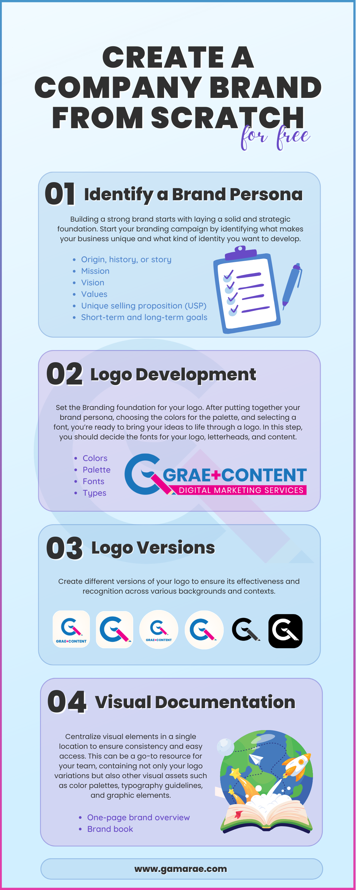
After learning about the nuances and significance of branding, it’s time for you to create your brand from scratch—for free. While anyone can make a brand, only some approach it strategically. Clients ask me to create a brand from scratch, and I’m sharing my methods with you today in the hopes that you can develop a good branding campaign.
These are the steps in making your company’s brand:
Identify a Brand Persona
Building a strong brand starts with laying a solid and strategic foundation. Start your branding campaign by identifying what makes your business unique and what kind of identity you want to develop. Everything has to come from you. Copying other companies’ brand statements will negatively impact your identity.
Define the following about your company:
- Origin, history, or story – share the story behind your company’s establishment. Highlight any milestones, challenges overcome, or values upheld since its inception. This narrative adds depth and authenticity to your brand.
- Mission – define your business’s purpose. What drives you beyond profit? Your mission statement should capture the essence of why your company exists and the impact it seeks to make.
- Vision – discuss your business’ future. What do you aspire to achieve in the long term? Your vision statement should be ambitious yet realistic, guiding your strategic decisions and inspiring stakeholders.
- Values – identify the core values that underpin your business practices. These principles guide your interactions with customers, employees, and the community. They should align with your mission and resonate with your target audience.
- Unique selling proposition (USP) – highlight what makes your products or services stand out from competitors, such as a distinctive approach to customer service or a revolutionary product feature.
- Short-term and long-term goals – your brand campaign ultimately rests upon your company goals. You must align your brand with your goals to succeed in your niche and offer.
If you’re at a loss, you can look at what your established competitors are doing for ideas or consult professionals to assist you during this step. Brand experts like Grae Content Digital Marketing Services offer brand foundation as a key consultation service.
Choose Brand Colors
It’s time to build your brand’s palette by effectively choosing brand colors. Your brand colors should reflect the identity that you want to develop. Start by utilizing our foundation, understanding your brand’s personality, values, and target audience, and considering the emotions and messages you want to convey.
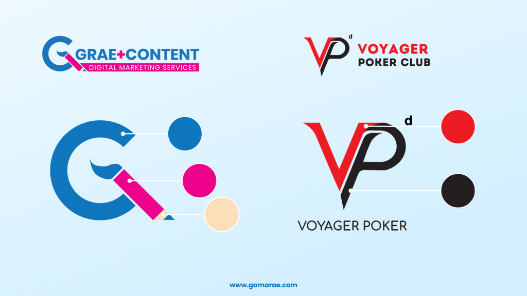
Next, delve into color theory to grasp the psychological effects of colors and their impact on emotions and behaviors. When I developed the logo for Voyager Poker Club, I used black and red, the card suit colors. The logo would look good against a white background.
My brand, Grae Content Digital Marketing Services (Grae Content or Grae+Content), uses blue as a primary color because I want to invoke business trust and reliability. Blue is also the primary color of brands like Facebook, Linkedin, and Twitter (before they rebranded to X). The pink was a secondary color that signified sophistication as used in Victoria Secret’s logo and the fact that the company is female-owned. The logo colors align with Grae Content’s promise to provide content that are both clean (blue) and sophisticated (pink).
Develop a Brand Palette
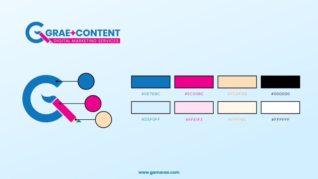
Put together a brand palette by choosing a primary color that aligns with your brand’s personality and resonates with your audience. Then, select one or two secondary colors to add depth. For Grae Content, I chose one cool (blue) and warm (pink) color.
If you’re uncertain about your color choices, consider neutral colors, such as white, beige, gray, or black, which can complement other colors and improve your logo’s cohesiveness to busy backgrounds. For Grae Content, I used a neutral flesh color as part of the logo and brand palette.
Select Fonts
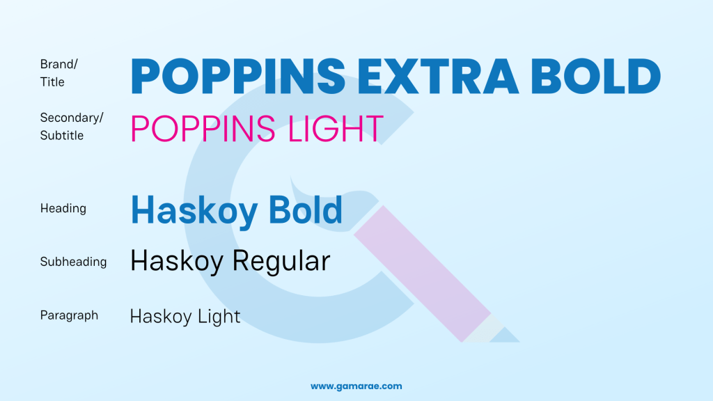
In this step, you should decide the fonts for your logo, letterheads, and content. For Grae Content, I used two weights of the same font, Poppins, because I wanted it to be flexible. I have always been partial to round fonts like Century Gothic, Questrial, and Comfortaa, so Poppins was not a surprising selection.
When choosing brand fonts, it’s crucial to use stylish fonts as accents rather than for body text or subtitles, as this can create visual clutter. Decorative, script and handwritten fonts work well for logos, headlines, and taglines, adding personality and showcasing your brand’s creative side. However, use them sparingly to avoid overwhelming the design and making it difficult to read. I preferred to keep my logo fonts flexible and straightforward for Grae Content— Poppins for my logo and Haskoy for my website and messaging.
Selecting multiple-weight fonts is essential for creating a visually appealing text hierarchy. This allows you to emphasize certain content parts while maintaining a cohesive look. The contrast between your fonts helps establish a visual hierarchy and adds interest to your design by using different weights, styles, or serif and sans-serif combinations. As I previously mentioned, my Grae Content full logo features two weights of the same font for contrast.
Fonts can add personality, but you should not sacrifice readability. Choose legible brand fonts, especially for brands with letters like small L and capital I, that can cause misspellings or confusions. Body texts should have fonts that are easily read at a glance to effectively convey your message.
Choose flexible fonts to work well across various designs, such as flyers, posters, and business cards, to ensure consistency in your brand’s visual identity and make it easier to maintain a cohesive look across various marketing materials.
Create a Logo
After putting together your brand persona, choosing the colors for the palette, and selecting a font, you’re ready to bring your ideas to life through a logo. My logo is a combination mark using a symbol or brand mark and words.
These are the types of logos to choose from and their respective features:
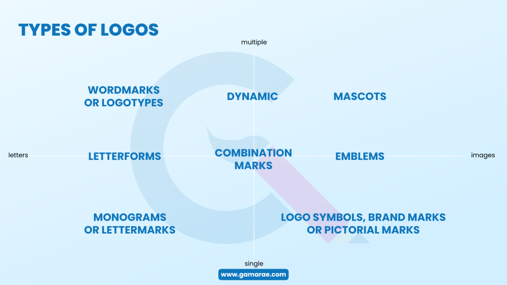
Decide on a Logo Type
Wordmarks or Logotypes

- Render a company’s name in a specific typeface or font.
- Require meticulous attention to detail for effective design.
- Ideal for brands with memorable names or aiming for a strong presence.
Examples: Wix, West Elm, Coca-Cola, Casper, Subway, eBay and Kellogg’s
Letterforms

- Single-letter representations of a company’s name.
- Complement with a full wordmark or logotype for versatility.
- Suitable for moderately recognized brands or those with lengthy names.
Examples: Netflix, Facebook, Pinterest, McDonald’s, Beats and Uber
Lettermarks or Monogram Logos

- Typographic representations of a brand’s initials.
- Often leads to brands being referred to by their abbreviated forms.
- Ideal for industries where using abbreviated names is common practice.
Examples: NASA, HBO, HP, IBM, CNN, and Louis Vuitton
Logo Symbols, Brand Marks, or Pictorial Marks

- Visual representations that embody a brand’s identity.
- Depict real-world objects and are instantly recognizable.
- Ideal for visually appealing and memorable logos.
Examples: Shell, Instagram, Apple, Snapchat and Target
Abstract Logo Marks

- Utilize non-representational forms to embody a company’s branding.
- Offer the opportunity to craft something truly original.
- Best used when there is a clear understanding of brand identity and message.
Examples: Nike, Airbnb, the Olympics, Chanel, Adidas, Google Drive, and Pepsi
Mascots
- Feature illustrated characters that serve as visual representatives for a brand.
- Offer a compelling way to connect with customers.
- Effective for companies targeting children and families.
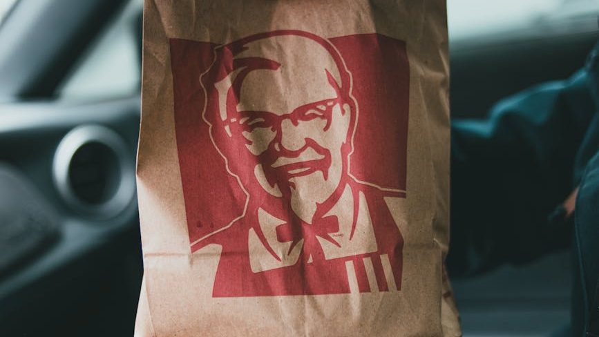
Examples: Colonel Sanders by KFC, Michelin Man by Michelin, Mr. Peanut by Planters, Tony the Tiger by Kellogg’s and Cap’n Crunch
Emblems
- Designs reminiscent of crests that blend text and symbolic imagery.
- Provide space for a slogan that conveys the brand’s message.
- Popular among universities, sports teams, and coffee brands.
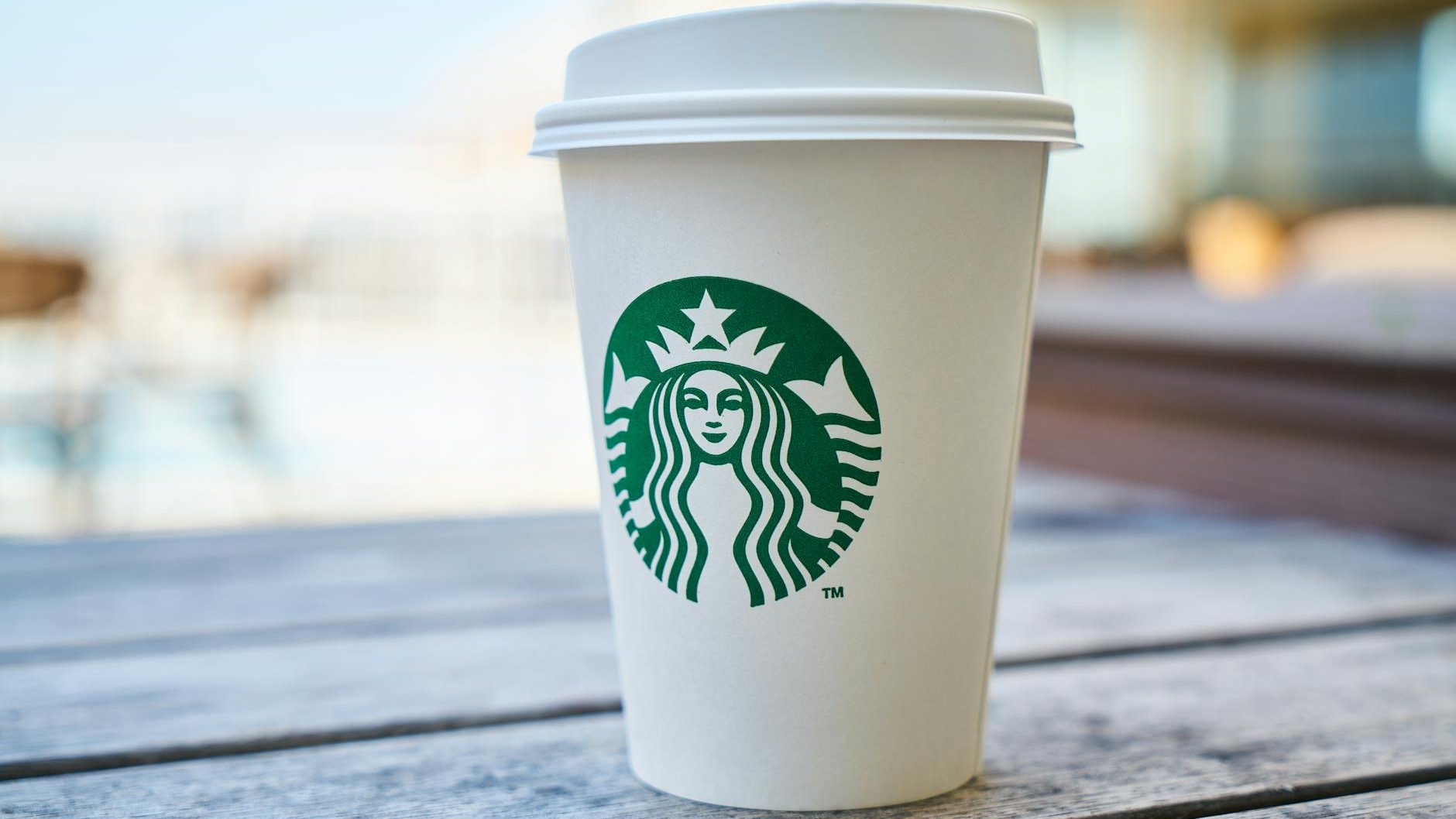
Examples: Harley-Davidson, Starbucks, NFL, Stella Artois, Manchester United and Warner Brothers
Combination Marks

- Blend images with words, offering versatility.
- Allow for various logo variations while maintaining a consistent visual identity.
- Excellent starting points for building brand recognition.
Examples: Dropbox, Taco Bell, NBC, Toblerone, CVS, and Dove
Dynamic Marks

- Assume various forms, making them versatile.
- Particularly effective for dynamic brands aiming to stay fresh and innovative.
- Essential to maintain consistency to nurture positive associations with the brand.
Examples: Nickelodeon, MTV, Virgin and Google
Logos are easy to create even without an artistic background through image generators or Canva, but you must be careful about commercial rights. Grae Content Digital Marketing Services offers an in-depth logo creation process that helps you build an original brand with Adobe Illustrator and Photoshop to ensure the highest possible quality and resolution.
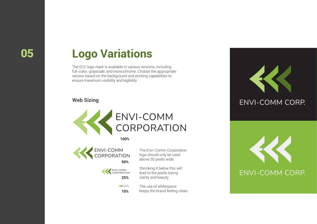
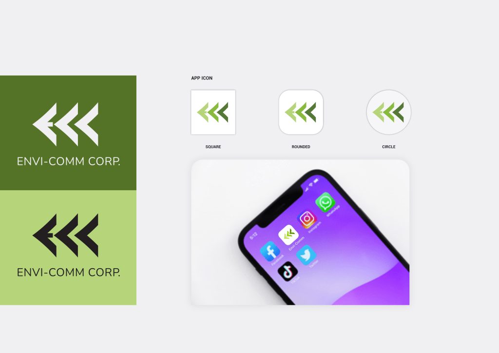
Make Different Logo Versions
Create different versions of your logo to ensure its effectiveness and recognition across various backgrounds and contexts. A monochromatic version is helpful for black-and-white environments, where colored logos might lose clarity. Additionally, optimizing versions for light and dark backgrounds ensures visibility and consistency.
Finally, scalable versions accommodate different sizes, maintaining legibility across various applications:
- Full-sized landscape – ideal height between 300 and 700 pixels and width between 1280 and 1920 pixels for letterheads, banners, etc.
- Square – fits into a square for smaller spaces like apps or 1:1 ad spaces.
- Round – fits into a circle for social media profiles and other circular areas.
- Simplified, favicon or icon version – for websites and small spaces.
Simplified versions are valuable in busy environments, preventing your logo from getting lost among other elements and colors. Plan for these variations to ensure that your logo remains impactful, effective and consistent in reinforcing your brand identity.
Collate a One-Page Brand Visual Overview
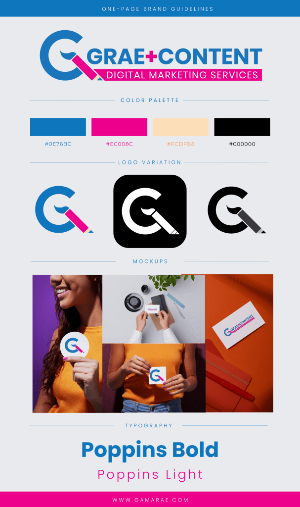
Create a one-page brand guideline or overview to centralize visual elements in a single location for reference and internal use to ensure consistency and easy access. You can use this as a go-to resource for your team, containing not only your logo variations but also other visual assets such as color palettes, typography guidelines, and graphic elements.
Having everything in one place can streamline the design process, reduce the risk of inconsistencies, and make it easier for team members to collaborate effectively. Maintaining a one-page brand overview helps new team members quickly familiarize themselves with your brand’s visual identity, ensuring they adhere to your brand guidelines.
Compose a Brand Book
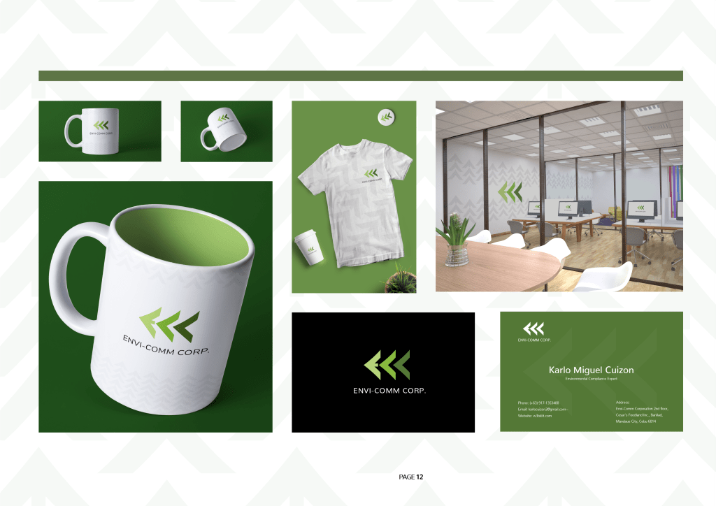
Finally, create a Brand Book or a compilation of brand guidelines to help suppliers and partners understand how to handle your brand elements. This step is completely optional in the very beginning, but necessary when you’re scaling your operations from less than ten employees. Check out one of the brand guidelines I did for a client.
Branding is the Foundation of a Strong Company
A strong brand identity differentiates a company from its competitors and builds customer trust and loyalty. Consistent branding across all touchpoints fosters recognition and reinforces the company’s values and promises. Identity consistency leads to increased customer engagement, higher sales, and business growth.
Therefore, investing in branding is essential for any company looking to establish a strong presence in the market and achieve long-term success. Grae Content offers a wide range of branding services, so you only need to worry about your business operations, and we’ll handle the technical and creative branding aspects.

Leave a comment